|
|
|
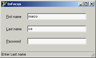
Control-Related TechniquesAfter this general overview of the most commonly used Delphi controls, I'll devote some space to discussing generic core techniques not related to a specific component. I'll cover the input focus, control anchors, the use of the splitter component, and the display of fly-by hints. Of course, these topics don't include everything you can do with visual controls, but they provide a starting point for exploration to get you up and running with some of the most common techniques. Handling the Input FocusUsing the TabStop and TabOrder properties available in most controls, you can specify the order in which controls will receive the input focus when the user presses the Tab key. Instead of setting the tab order property of each component of a form manually, you can use the shortcut menu of the Form Designer to activate the Edit Tab Order dialog box, shown in Figure 5.6. Besides these basics settings, it is important to know that each time a component receives or loses the input focus, it receives a corresponding OnEnter or OnExit event. This allows you to fine-tune and customize the order of the user operations. Some of these techniques are demonstrated by the InFocus example, which creates a typical password-login window. Its form has three edit boxes with labels indicating their meaning, as shown in Figure 5.7. At the bottom of the window is a status area with prompts guiding the user. Each item needs to be entered in sequence. For the output of the status information, I've used the StatusBar component, with a single output area (obtained by setting its SimplePanel property to True). Here is a summary of the properties for this example. Notice the & character in the labels, indicating a shortcut key, and the connection of these labels with corresponding edit boxes (using the FocusControl property):
object FocusForm: TFocusForm
  ActiveControl = EditFirstName
  Caption = 'InFocus'
  object Label1: TLabel
    Caption = '&First name'
    FocusControl = EditFirstName
  end
  object EditFirstName: TEdit
    OnEnter = GlobalEnter
    OnExit = EditFirstNameExit
  end
  object Label2: TLabel
    Caption = '&Last name'
    FocusControl = EditLastName
  end
  object EditLastName: TEdit
    OnEnter = GlobalEnter
  end
  object Label3: TLabel
    Caption = '&Password'
    FocusControl = EditPassword
  end
  object EditPassword: TEdit
    PasswordChar = '*'
    OnEnter = GlobalEnter
  end
  object StatusBar1: TStatusBar
    SimplePanel = True
  end
end
The program is simple and performs only two operations. The first is to identify, in the status bar, the edit control that has the focus. It does this by handling the controls' OnEnter event, using a single generic event handler to avoid repetitive code. In the example, instead of storing extra information for each edit box, I've checked each control of the form to determine which label is connected to the current edit box (indicated by the Sender parameter):
procedure TFocusForm.GlobalEnter(Sender: TObject);
var
  I: Integer;
begin
  for I := 0 to ControlCount - 1 do
    // if the control is a label
    if (Controls [I] is TLabel) and
      // and the label is connected to the current edit box
      (TLabel(Controls[I]).FocusControl = Sender) then
    // copy the text, leaving off the initial & character
    StatusBar1.SimpleText := 'Enter ' +
      Copy (TLabel(Controls[I]).Caption, 2, 1000);
end;
The form's second event handler relates to the first edit box's OnExit event. If the control is left empty, it refuses to release the input focus and sets it back before showing a message to the user. The methods also look for a given input value, automatically filling the second edit box and moving the focus directly to the third one:
procedure TFocusForm.EditFirstNameExit(Sender: TObject);
begin
  if EditFirstName.Text = '' then
  begin
    // don't let the user get out
    EditFirstName.SetFocus;
    MessageDlg ('First name is required', mtError, [mbOK], 0);
  end
  else if EditFirstName.Text = 'Admin' then
  begin
    // fill the second edit and jump to the third
    EditLastName.Text := 'Admin';
    EditPassword.SetFocus;
  end;
end;
Control AnchorsTo let you create a nice, flexible user interface, with controls adapting themselves to the current size of the form, Delphi allows you to determine the relative position of a control with the Anchors property. Before this feature was introduced in Delphi 4, every control placed on a form had coordinates relative to the top and bottom, unless it was aligned to the bottom or right side. Aligning is good for some controls but not all of them, particularly buttons. By using anchors, you can make the position of a control relative to any side of the form. For example, to anchor a button to the bottom-right corner of the form, you place the button in the required position and set its Anchors property to [akRight, akBottom]. When the form size changes, the distance of the button from the anchored sides is kept fixed. In other words, if you set these two anchors and remove the two defaults, the button will remain in the bottom-right corner. On the other hand, if you place a large component such as a Memo or a ListBox in the middle of a form, you can set its Anchors property to include all four sides. This way the control will behave as an aligned control, growing and shrinking with the size of the form, but there will be some margin between it and the form sides.
As an example of both approaches, you can try the Anchors application, which has two buttons in the bottom-right corner and a list box in the middle. As shown in Figure 5.8, the controls automatically move and stretch as the form size changes. To make this form work properly, you must also set its Constraints property; otherwise, if the form becomes too small, the controls can overlap or disappear. 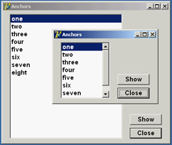
Figure 5.8: The controls of the Anchors example move and stretch automatically as the user changes the size of the form. No code is needed to move the controls, only proper use of the Anchors property. Notice that if you remove all the anchors or two opposite ones (for example, left and right), the resize operations will cause the control to float in the form. The control keeps its current size, and the system adds or removes the same number of pixels on each side of it. This anchor can be defined as centered, because if the component is initially in the middle of the form it will keep that position. If you want a centered control you should generally use both opposite anchors, so that if the user makes the form larger, the control size will grow as well. In the case just presented, making the form larger leaves a small control in its center. Using the Splitter ComponentThere are several ways to implement form-splitting techniques in Delphi, but the simplest approach is to use the Splitter component, found in the Additional page of the Component Palette. To make it more effective, the splitter can be used in combination with the Constraints property of the controls it relates to. As you'll see in the Split1 example, this technique allows you to define maximum and minimum positions for the splitter and the form. To build this example, simply place a ListBox component in a form; then add a Splitter component, a second ListBox, another Splitter, and finally a third ListBox component. The form also has a simple toolbar based on a panel. By simply placing these two splitter components, you give your form the complete functionality of moving and sizing the controls it hosts at run time. The Width, Beveled, and Color properties of the splitter components determine their appearance, and in the Split1 example you can use the toolbar controls to change them. Another relevant property is MinSize, which determines the minimum size of the form's components. During the splitting operation (see Figure 5.9), a line marks the final position of the splitter, but you cannot drag this line beyond a certain limit. The behavior of the Split1 program is not to let controls become too small. An alternative technique is to set the new AutoSnap property of the splitter to True. This property will make the splitter hide the control when its size goes below the MinSize limit. 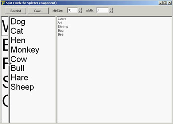
Figure 5.9: The Split1 example's splitter component determines the minimum size for each control on the form, even those not adjacent to the splitter. I suggest you try using the Split1 program, so that you'll fully understand how the splitter affects its adjacent controls and the other controls of the form. Even if you set the MinSize property, a user can reduce the size of the program's entire form to a minimum, hiding some of the list boxes. If you test the Split2 version of the example, you'll get better behavior. In Split2, I've set some Constraints for the ListBox controls: object ListBox1: TListBox Constraints.MaxHeight = 400 Constraints.MinHeight = 200 Constraints.MinWidth = 150 The size constraints are applied only as you resize the controls; so, to make this program work satisfactorily, you have to set the ResizeStyle property of the two splitters to rsUpdate. This value indicates that the controls' position is updated for every movement of the splitter, not only at the end of the operation. If you select the rsLine or the new rsPattern value, instead, the splitter simply draws a line in the required position, checking the MinSize property but not the constraints of the controls.
Horizontal SplittingYou can also use the Splitter component for horizontal splitting, instead of the default vertical splitting. Basically, you place a component on a form, align it to the top, and then place the splitter on the form. By default, the splitter will be left aligned. Choose the alTop value for the Align property, and you're done. You can see a form with a horizontal splitter in the SplitH example. This program has two memo components into which you can open a file, and it has a splitter dividing them, defined as follows: object Splitter1: TSplitter Cursor = crVSplit Align = alTop OnMoved = Splitter1Moved end The program features a status bar, which keeps track of the current height of the two memo components. It handles the OnMoved event of the splitter (the only event of this component) to update the text of the status bar. The same code is executed whenever the form is resized:
procedure TForm1.Splitter1Moved(Sender: TObject);
begin
  StatusBar1.Panels[0].Text := Format ('Upper Memo: %d - Lower Memo: %d',
    [MemoUp.Height, MemoDown.Height]);
end;
Accelerator KeysSince Delphi 5, you don't need to enter the & character in the Caption of a menu item, which provides an automatic accelerator key if you omit one. Delphi's automatic accelerator-key system can also figure out if you have entered conflicting accelerator keys and fix them on the fly. This doesn't mean you should stop adding custom accelerator keys with the & character, because the automatic system simply uses the first available letter and doesn't follow the default standards. You might also find better mnemonic keys than those chosen by the automatic system. This feature is controlled by the AutoHotkeys property, which is available in the main menu component and in each of the pull-down menus and menu items. In the main menu, this property defaults to maAutomatic; in the pull-downs and menu items, it defaults to maParent, so the value you set for the main menu component will be used automatically by all the subitems, unless they have a specific value of maAutomatic or maManual. The engine behind this system is the RethinkHotkeys method of the TMenuItem class, and the companion InternalRethinkHotkeys method. There is also a RethinkLines method, which checks whether a pull-down has two consecutive separators or begins or ends with a separator. In all these cases, the separator is automatically removed. One of the reasons Delphi includes this feature is the support for translations. When you need to translate an application's menu, it is convenient if you don't have to deal with the accelerator keys, or at least if you don't have to worry about whether two items on the same menu conflict. Having a system that can automatically resolve similar problems is definitely an advantage. Another motivation was Delphi's IDE. With all the dynamically loaded packages that install menu items in the IDE main menu or in pop-up menus, and with different packages loaded in different versions of the product, it's next to impossible to get nonconflicting accelerator-key selections in each menu. That is why this mechanism isn't a wizard that does static analysis of your menus at design time; it was created to deal with the real problem of managing menus created dynamically at run time.
Using the Fly-by HintsAnother common element in toolbars is the tooltip, also called fly-by hint—text that briefly describes the button currently under the cursor. This text is usually displayed in a yellow box after the mouse cursor has remained steady over a button for a set amount of time. To add hints to a group of buttons or components, simply set the ShowHints property of the parent control to True and enter some text for the Hint property of each element. You might want to enable the hints for all the components on a form, or all the buttons of a toolbar or panel. If you want to have more control over how hints are displayed, you can use some of the properties and events of the Application object. This global object has, among others, the following properties:
For example, a program might allow a user to customize the hint background color by selecting a specific color with the following code: ColorDialog.Color := Application.HintColor; if ColorDialog.Execute then Application.HintColor := ColorDialog.Color; As an alternative, you can change the hint color by handling the OnShowHint property of the Application object. This handler can change the hint's color for specific controls. The OnShowHint event is used in the CustHint example described in the next section. Customizing the HintsJust as you can add hints to an application's toolbar, you can add hints to forms or to the components of a form. For a large control, the hint will show up near the mouse cursor. In some cases, it is important to know that a program can freely customize how hints are displayed. One thing you can do is to change the value of the properties of the Application object, as I mentioned at the end of the last section. To obtain more control over hints, you can customize them even further by assigning a method to the application's OnShowHint event. You need to either hook up this event manually or—better—add an ApplicationEvents component to the form and handle its OnShowHint event. The event handler method has some interesting parameters, such as a string with the hint's text, a Boolean flag for its activation, and a THintInfo structure with further information, including the control, the hint position, and its color. The parameters are passed by reference, so you have a chance to change them and also modify the values of the THintInfo structure; for example, you can change the position of the hint window before it is displayed. This is what I've done in the CustHint example, which shows the hint for the label at the center of its area.
procedure TForm1.ShowHint (var HintStr: string; var CanShow: Boolean;
  var HintInfo: THintInfo);
begin
  with HintInfo do
    // if the control is the label show the hint in the middle
    if HintControl = Label1 then
      HintPos := HintControl.ClientToScreen (Point (
        HintControl.Width div 2, HintControl.Height div 2));
end;
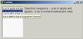
The code retrieves the center of the generic control (the HintInfo.HintControl) and then converts its coordinates to screen coordinates, applying the ClientToScreen method to the control. You can further update the CustHint example in a different way. The form's ListBox control has some rather long text items, so you might want to display the entire text in a hint while the mouse moves over the item. Setting a single hint for the list box won't do, of course. A good solution is to customize the hint system by providing a hint dynamically corresponding to the text of the list box item under the cursor. You also need to indicate to the system which area the hint belongs to, so that by moving over the next line a new hint will be displayed. You accomplish this by setting the CursorRect field of the THintInfo record, which indicates the area of the component that the cursor can move over without disabling the hint. When the cursor moves outside this area, Delphi hides the hint window. Here is the related code snippet I've added to the ShowHint method: else if HintControl = ListBox1 then
begin
nItem := ListBox1.ItemAtPos(
Point (CursorPos.x, CursorPos.Y), True);
if nItem >= 0 then
begin
// set the hint string
HintStr := ListBox1.Items[nItem];
// determine area for hint validity
CursorRect := ListBox1.ItemRect(nItem);
// display over the item
HintPos := HintControl.ClientToScreen (Point(
0, ListBox1.ItemHeight * (nItem - ListBox1.TopIndex)));
end
else
CanShow := False;
end;
The resulting effect is that each line of the list box appears to have a specific hint, as shown in Figure 5.10. The hint position is computed so that it covers the current item text, extending beyond the list box border. Owner-Draw Controls and StylesIn Windows, the system is usually responsible for painting buttons, list boxes, edit boxes, menu items, and similar elements. Basically, these controls know how to paint themselves. As an alternative, however, the system allows the owner of these controls, generally a form, to paint them. This technique, available for buttons, list boxes, combo boxes, and menu items, is called owner-draw. In the VCL, the situation is slightly more complex. The components can take care of painting themselves in this case (as in the TBitBtn class for bitmap buttons) and possibly activate corresponding events. The system sends the request for painting to the owner (usually the form), and the form forwards the event back to the proper control, firing its event handlers. In CLX, some of the controls, such as ListBoxes and ComboBoxes, surface events very similar to Windows owner-draw, but menus lack them. The native approach of Qt is to use styles to determine the graphical behavior of all the controls in the system, of a specific application, or of a given control. I'll introduce styles shortly, later in this section.
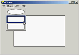
Owner-Draw Menu ItemsVCL makes the development of graphical menu items quite simple compared to the traditional approach of the Windows API: You set the OwnerDraw property of a menu item component to True and handle its OnMeasureItem and OnDrawItem events. In the OnMeasureItem event, you can determine the size of the menu items. This event handler is activated once for each menu item when the pull-down menu is displayed and has two reference parameters you can set: Width and Height. In the OnDrawItem event, you paint the actual image. This event handler is activated every time the item has to be repainted. This happens when Windows first displays the items and each time the status changes; for example, when the mouse moves over an item, the item should become highlighted. To paint the menu items, you must consider all the possibilities, including drawing the highlighted items with specific colors, drawing the check mark if required, and so on. Luckily, the Delphi event passes to the handler the Canvas where it should paint, the output rectangle, and the status of the item (selected or not). In the ODMenu example, I'll handle the highlighted color, but skip other advanced aspects (such as the check marks). I've set the OwnerDraw property of the menu and written handlers for some of the menu items. To write a single handler for each event of the three color-related menu items, I've set their Tag property to the value of the color in the OnCreate event handler of the form. This makes the handler of the items' OnClick event quite straightforward: procedure TForm1.ColorClick(Sender: TObject); begin ShapeDemo.Brush.Color := (Sender as TComponent).Tag end; The handler of the OnMeasureItem event doesn't depend on the actual items, but uses fixed values (different from the handler of the other pull-down). The most important portion of the code is in the handlers of the OnDrawItem events. For the color, you use the value of the tag to paint a rectangle of the given color, as you can see in Figure 5.11. Before doing this, however, you have to fill the background of the menu items (the rectangular area passed as a parameter) with the standard color for the menu (clMenu) or the selected menu items (clHighlight):
procedure TForm1.ColorDrawItem(Sender: TObject; ACanvas: TCanvas;
  ARect: TRect; Selected: Boolean);
begin
  // set the background color and draw it
  if Selected then
    ACanvas.Brush.Color := clHighlight
  else
    ACanvas.Brush.Color := clMenu;
  ACanvas.FillRect (ARect);
  // show the color
  ACanvas.Brush.Color := (Sender as TComponent).Tag;
  InflateRect (ARect, -5, -5);
  ACanvas.Rectangle (ARect.Left, ARect.Top, ARect.Right, ARect.Bottom);
end;
The three handlers for this event of the Shape pull-down menu items are all different, although they use similar code:
procedure TForm1.Ellipse1DrawItem(Sender: TObject; ACanvas: TCanvas;
  ARect: TRect; Selected: Boolean);
begin
  // set the background color and draw it
  if Selected then
    ACanvas.Brush.Color := clHighlight
  else
    ACanvas.Brush.Color := clMenu;
  ACanvas.FillRect (ARect);
  // draw the ellipse
  ACanvas.Brush.Color := clWhite;
  InflateRect (ARect, -5, -5);
  ACanvas.Ellipse (ARect.Left, ARect.Top, ARect.Right, ARect.Bottom);
end;
A ListBox of ColorsAs you have just seen for menus, list boxes have an owner-draw capability, which means a program can paint the items of a list box. The same support is provided for combo boxes and is also available on CLX. To create an owner-draw list box, you set its Style property to lbOwnerDrawFixed or lbOwnerDrawVariable. The first value indicates that you will set the height of the list box items by specifying the ItemHeight property and that this will be the height of every item. The second owner-draw style indicates a list box with items of different heights; in this case, the component will trigger the OnMeasureItem event for each item, to ask the program for their heights. In the ODList example (and its QODList version), I'll stick with the first, simpler, approach. The example stores color information along with the list box items and then draws the items using those colors (instead of using a single color for the whole list). The DFM or XFM file of every form, including this one, has a TextHeight attribute, which indicates the number of pixels required to display text. You should use this value for the list box's ItemHeight property. An alternative solution is to compute this value at run time, so that if you later change the font at design time, you don't have to remember to set the height of the items accordingly.
Because TextHeight is not a property, although it is listed in the form description, you cannot access it directly. Studying the VCL source code, I found that this value is computed by calling a private method of the form: GetTextHeight. Because it is private, you cannot call this function. Instead, you can duplicate its code (which is quite simple) in the FormCreate method of the form, after selecting the font of the list box: Canvas.Font := ListBox1.Font;
ListBox1.ItemHeight := Canvas.TextHeight('0');
Next you add some items to the list box. Because this is a list box of colors, you want to add color names to the Items of the list box and the corresponding color values to the Objects data storage related to each list item. Instead of adding the two values separately, I've written a procedure to add new items to the list:
procedure TODListForm.AddColors (Colors: array of TColor);
var
  I: Integer;
begin
  for I := Low (Colors) to High (Colors) do
    ListBox1.Items.AddObject (ColorToString (Colors[I]), TObject(Colors[I]));
end;
This method uses an open-array parameter, an array of an undetermined number of elements of the same type. For each item passed as a parameter, you add the name of the color to the list, and you add its value to the related data by calling the AddObject method. To obtain the string corresponding to the color, you call the Delphi ColorToString function. It returns a string containing either the corresponding color constant, if any, or the hexadecimal value of the color. The color data is added to the list box after casting its value to the TObject data type (a four-byte reference), as required by the AddObject method.
In the ODList example, this method is called in the form's OnCreate event handler (after the height of the items has been set): AddColors ([clRed, clBlue, clYellow, clGreen, clFuchsia, clLime, clPurple, clGray, RGB (213, 23, 123), RGB (0, 0, 0), clAqua, clNavy, clOlive, clTeal]); To compile the CLX version of this code, I've added to it the RGB function described earlier in the section "Colors." The code used to draw the items is not particularly complex. You simply retrieve the color associated with the item, set it as the color of the font, and then draw the text:
procedure TODListForm.ListBox1DrawItem(Control: TWinControl; Index: Integer;
  Rect: TRect; State: TOwnerDrawState);
begin
  with Control as TListbox do
  begin
    // erase
    Canvas.FillRect(Rect);
    // draw item
    Canvas.Font.Color := TColor (Items.Objects [Index]);
    Canvas.TextOut(Rect.Left, Rect.Top, Listbox1.Items[Index]);
   end;
end;
The system already sets the proper background color, so the selected item is displayed properly even without any extra code on your part. Moreover, the program allows you to add new items by double-clicking on the list box:
procedure TODListForm.ListBox1DblClick(Sender: TObject);
begin
  if ColorDialog1.Execute then
    AddColors ([ColorDialog1.Color]);
end;
If you try using this capability, you'll notice that some colors you add are turned into color names (one of the Delphi color constants), whereas others are converted into hexadecimal numbers.
|
|
|||||||||||||||||||||||||||||||||||||||||||||||||||||||||||||||||||||||||||||||||||||||||||||||||||||||||||||||||||||||||||||||||||||||||||||||||||||||||||||||||||||||||||||||||||||||||||||||||||||||||||||||||||||||
|
| Copyright © 2004-2024 "Delphi Sources" by BrokenByte Software. Delphi Programming Guide |
   |