

|
|
|
The ToolBar ControlTo create a toolbar, Delphi includes a specific component that encapsulates the corresponding Win32 common control or the corresponding Qt widget in VisualCLX. This component provides a toolbar with its own buttons, and it has many advanced capabilities. You place the component on a form and then use the component editor (the shortcut menu activated by a right-click) to create buttons and separators. The toolbar is populated with objects of the TToolButton class. These objects have a fundamental property, Style, which determines their behavior:
To create a graphic toolbar, you can add an ImageList component to the form, load some bitmaps into it, and then connect the ImageList with the Images property of the toolbar. By default, the images will be assigned to the buttons in the order they appear, but you can change this behavior quite easily by setting the ImageIndex property of each toolbar button. You can prepare further ImageLists for special button conditions and assign them to the DisabledImages and HotImages properties of the toolbar. The first group is used for the disabled buttons; the second is used for the button currently under the mouse. The RichBar ExampleAs an example of the use of a toolbar, I've built the RichBar application, which has a RichEdit component you can operate by using the toolbar. The program has buttons for loading and saving files, for copy and paste operations, and to change some of the attributes of the current font. I won't cover the many details of the RichEdit control's features, which I briefly discussed in a previous chapter, nor discuss the details of this application, which has quite a lot of code. All I'll do is focus on features specific to the ToolBar used by the example and visible in Figure 6.5. This toolbar has buttons, separators, and even a drop-down menu and two combo boxes (discussed in the next section). The various buttons implement features, including opening and saving text files—the program asks the user to save any modified file before opening a new one, to avoid losing any changes. The file-handling portion of the program is quite complex but it is worth exploring, because many file-based applications will use similar code. More details are available in the file RichBar File Operations.rtf with the source code for this example, a file you can open with the RichBar program itself. Besides file operations, the program supports copy and paste operations and font management. The copy and paste operations don't require an interaction with the VCL Clipboard object, because the component can handle them with simple commands like these: RichEdit.CutToClipboard; RichEdit.CopyToClipboard; RichEdit.PasteFromClipboard; RichEdit.Undo; It is a little more advanced to know when these operations (and the corresponding buttons) should be enabled. You can enable Copy and Cut buttons when some text is selected, in the OnSelectionChange event of the RichEdit control: procedure TFormRichNote.RichEditSelectionChange(Sender: TObject); begin tbtnCut.Enabled := RichEdit.SelLength > 0; tbtnCopy.Enabled := tbtnCut.Enabled; end; The Copy operation cannot be determined by an action of the user, because it depends on the content of the Clipboard, which is also influenced by other applications. One approach is to use a timer and check the Clipboard content from time to time. A better approach is to use the OnIdle event of the Application object (or the ApplicationEvents component). Because the RichEdit control supports multiple Clipboard formats, the code cannot simply look at those, but should ask the component itself, using a low-level feature not surfaced by the Delphi control: procedure TFormRichNote.ApplicationEvents1Idle(Sender: TObject; var Done: Boolean); begin // update toolbar buttons tbtnPaste.Enabled := RichEdit.Perform (em_CanPaste, 0, 0) <> 0; end; Basic font management is given by the Bold and Italic buttons, which have similar code. The Bold button toggles the relative attribute from the selected text (or changes the style at the current edit position):
procedure TFormRichNote.BoldExecute(Sender: TObject);
begin
  with RichEdit.SelAttributes do
    if fsBold in Style then
      Style := Style - [fsBold]
    else
      Style := Style + [fsBold];
end;
Again, the current status of the button is determined by the current selection, so you'll need to add the following line to the RichEditSelectionChange method: tbtnBold.Down := fsBold in RichEdit.SelAttributes.Style; A Menu and a Combo Box in a ToolbarBesides a series of buttons, the RichBar example has a drop-down menu and a couple of combo boxes, a feature shared by many common applications. The drop-down button allows selection of the font size, and the combo boxes allow rapid selection of the font family and the font color. This second combo is built using a ColorBox control. The Size button is connected to a PopupMenu component (called SizeMenu) using the DropdownMenu property. A user can click the button, firing its OnClick event as usual, or select the drop-down arrow, open the pop-up menu (see again Figure 6.5), and choose one of its options. This case has three possible font sizes, per the menu definition:
object SizeMenu: TPopupMenu
  object Small1: TMenuItem
    Tag = 10
    Caption = 'Small'
    OnClick = SetFontSize
  end
  object Medium1: TMenuItem
    Tag = 16
    Caption = 'Medium'
    OnClick = SetFontSize
  end
  object Large1: TMenuItem
    Tag = 32
    Caption = 'Large'
    OnClick = SetFontSize
  end
end
Each menu item has a tag indicating the actual size of the font, activated by a shared event procedure TFormRichNote.SetFontSize(Sender: TObject); begin RichEdit.SelAttributes.Size := (Sender as TMenuItem).Tag; end; The ToolBar control is a full-featured control container, so you can take an edit box, a combo box, and other controls and place them directly inside the toolbar. The combo box in the toolbar is initialized in the FormCreate method, which extracts the screen fonts available in the system: ComboFont.Items := Screen.Fonts; ComboFont.ItemIndex := ComboFont.Items.IndexOf (RichEdit.Font.Name) The combo box initially displays the name of the default font used in the RichEdit control, which is set at design time. This value is recomputed each time the current selection changes, using the font of the selected text, along with the current color for the ColorBox:
procedure TFormRichNote.RichEditSelectionChange(Sender: TObject);
begin
  ComboFont.ItemIndex :=
    ComboFont.Items.IndexOf (RichEdit.SelAttributes.Name);
  ColorBox1.Selected := RichEdit.SelAttributes.Color;
end;
When a new font is selected from the combo box, the reverse action takes place. The text of the current combo box item is assigned as the name of the font for any text selected in the RichEdit control: RichEdit.SelAttributes.Name := ComboFont.Text; The selection of a color in the ColorBox activates similar code. A Simple Status BarBuilding a status bar is even simpler than building a toolbar. Delphi includes a specific StatusBar component, based on the corresponding Windows common control (a similar control is available in VisualCLX). This component can be used almost like a panel when its SimplePanel property is set to True. In this case, you can use the SimpleText property to output some text. The real advantage of this component, however, is that it allows you to define a number of subpanels by activating its Panels property editor. (You can also display this property editor by double-clicking the status bar control or perform the same operations using the Object TreeView.) Each subpanel has its own graphical attributes, which you can customize using the Object Inspector. Another feature of the status bar component is the "size grip" area added to the lower-right corner of the bar, which is useful for resizing the form. This is a typical element of the Windows user interface, and you can partially control it with the SizeGrip property (it auto-disables when the form is not resizable). A status bar has various uses. The most common is to display information about the menu item currently selected by the user. In addition, a status bar often displays other information about the status of a program: the position of the cursor in a graphical application, the current line of text in a word processor, the status of the lock keys, the time and date, and so on. To show information on a panel, you use its Text property, generally in an expression like this: StatusBar1.Panels[1].Text := 'message'; In the RichBar example, I've built a status bar with three panels, for command hints, the status of the Caps Lock key, and the current editing position. The StatusBar component of the example actually has four panels—you need to define the fourth in order to delimit the area of the third panel. The last panel is always large enough to cover the remaining surface of the status bar.
The panels are not independent components, so you cannot access them by name, only by position as in the preceding code snippet. A good solution to improve the readability of a program is to define a constant for each panel you want to use, and then use these constants when referring to the panels. This is my sample code: const sbpMessage = 0; sbpCaps = 1; sbpPosition = 2; In the first panel of the status bar, I want to display the toolbar button's hint message. The program obtains this effect by handling the application's OnHint event, again using the ApplicationEvents component, and copying the current value of the application's Hint property to the status bar: procedure TFormRichNote.ApplicationEvents1Hint (Sender: TObject); begin StatusBar1.Panels[sbpMessage].Text := Application.Hint; end; By default, this code displays in the status bar the same text of the fly-by hints, which aren't generated for menu items. You can use the Hint property to specify different strings for the two cases, by writing a string divided into two portions by a separator: the pipe (|) character. For example, you might enter the following as the value of the Hint property: 'New|Create a new document' The first portion of the string, New, is used by fly-by hints, and the second portion, Create a new document, by the status bar. You can see an example in Figure 6.6. 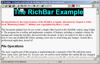
Figure 6.6: The StatusBar of the RichBar example displays a more detailed description than the fly-by hint.
The second panel displays the status of the Caps Lock key, obtained by calling the GetKeyState API function, which returns a state number. If the low-order bit of this number is set (that is, if the number is odd), then the key is pressed. I've decided to check this state when the application is idle, so the test is executed every time a key is pressed but also as soon as a message reaches the window (in case the user changes this setting while working with another program). I've added to the ApplicationEvents1Idle handler a call to the custom CheckCapslock method, implemented as follows:
procedure TFormRichNote.CheckCapslock;
begin
  if Odd (GetKeyState (VK_CAPITAL)) then
    StatusBar1.Panels[sbpCaps].Text := 'CAPS'
  else
    StatusBar1.Panels[sbpCaps].Text := '';
end;
Finally, the program uses the third panel to display the current cursor position (measured in lines and characters per line) every time the selection changes. Because the CaretPos values are zero-based (that is, the upper-left corner is line 0, character 0), I've added one to each value to make them more reasonable for a casual user:
procedure TFormRichNote.RichEditSelectionChange(Sender: TObject);
begin
  ...
  // update the position in the status bar
  StatusBar.Panels[sbpPosition].Text := Format ('%d/%d',
    [RichEdit.CaretPos.Y + 1, RichEdit.CaretPos.X + 1]);
end;
|
|
|||||||||||||||||||||||||||||||||||||||||||||||||||||||||||||||||||||||||||||||||||||||||||||||||||||||||||||||||||||||||||||||||||||||||||||||||||||||||||||||||||||||||||||||||||||||||||
|
| Copyright © 2004-2024 "Delphi Sources" by BrokenByte Software. Delphi Programming Guide |
   |

