|
|
|
The TForm ClassForms in Delphi are defined by the TForm class, which is included in the Forms unit of VCL. Of course, there is now a second definition of forms in VisualCLX. Although I'll mainly refer to the VCL class in this chapter, I'll also highlight differences with the cross-platform version provided in CLX. The TForm class is part of the windowed-controls hierarchy, which starts with the TWinControl (or TWidgetControl) class. TForm inherits from the almost complete TCustomForm, which in turn inherits from TScrollingWinControl (or TScrollingWidget). Having all the features of their many base classes, forms have a long series of methods, properties, and events. For this reason, I won't try to list them here—I'd rather present some interesting techniques related to forms throughout this chapter. I'll begin by presenting a technique for not defining the form of a program at design time, using the TForm class directly, and then explore a few interesting properties of the form class. Throughout the chapter, I'll point out a few differences between VCL forms and CLX forms. I've built a CLX version for most of the examples, so you can immediately begin experimenting with forms and dialog boxes in CLX, as well as VCL. As in past chapters, the CLX version of each example is prefixed by the letter Q. Using Plain FormsDelphi developers tend to create forms at design time, which implies deriving a new class from the base class, and build the content of the form visually. This is certainly a reasonable standard practice, but it is not compulsory to create a descendant of the TForm class to show a form, particularly if it is a simple one. Consider this case: Suppose you have to show a rather long message (based on a string) to a user, and you don't want to use the simple predefined message box because it will look too large and won't provide scroll bars. You can create a form with a memo component in it, and display the string inside the memo. Nothing prevents you from creating this form in the standard visual way, but you might consider doing this in code, particularly if you need a large degree of flexibility. The DynaForm and QDynaForm examples (available among the book source code), which are somewhat extreme, have no form defined at design time but include a unit with this function:
procedure ShowStringForm (str: string);
var
  form: TForm;
begin
  Application.CreateForm (TForm, form);
  form.caption := 'DynaForm';
  form.Position := poScreenCenter;
  with TMemo.Create (form) do
  begin
    Parent := form;
    Align := alClient;
    Scrollbars := ssVertical;
    ReadOnly := True;
    Color := form.Color;
    BorderStyle := bsNone;
    WordWrap := True;
    Text := str;
  end;
  form.Show;
end;
I had to create the form by calling the Application global object's CreateForm method (a feature required by Delphi applications and discussed in Chapter 8, "The Architecture of Delphi Applications"); other than that, this code does dynamically what you generally do with the Form Designer. Writing this code is undoubtedly more tedious, but it allows also a greater deal of flexibility, because any parameter can depend on external settings. The previous ShowStringForm function is not executed by an event of another form, because there are no traditional forms in this program. Instead, I've modified the project's source code as follows:
program DynaForm;

uses
  Forms,
  DynaMemo in 'DynaMemo.pas';

{$R *.RES}

var
  str: string;

begin
  str := '';
  Randomize;
  while Length (str) < 2000 do
    str := str + Char (32 + Random (74));
  ShowStringForm (str);
  Application.Run;
end.
The effect of running the DynaForm program is a strange-looking form filled with random characters (as you can see in Figure 7.1)—it isn't terribly useful in itself, but it underscores the idea. 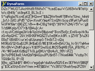
Figure 7.1: The dynamic form generated by the DynaForm example is completely created at run time, with no design-time support.
The Form StyleThe FormStyle property allows you to choose between a normal form (fsNormal) and the windows that make up a Multiple Document Interface (MDI) application. In this case, you'll use the fsMDIForm style for the MDI parent window—that is, the frame window of the MDI application—and the fsMDIChild style for the MDI child window. To learn more about the development of an MDI application, look at Chapter 8, "The Architecture of Delphi Applications." A fourth option is the fsStayOnTop style, which determines whether the form must always remain on top of all other windows, except for any that also happen to be "stay-on-top" windows. To create a top-most form (a form whose window is always on top), you need only set the FormStyle property, as indicated earlier. This property has two different effects, depending on the kind of form you apply it to:
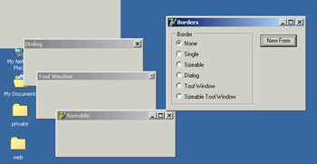
The Border StyleAnother important property of a form is its BorderStyle. This property refers to a visual element of the form, but it has a much more profound influence on the behavior of the window, as you can see in Figure 7.2. At design time, the form is always shown using the default value of the BorderStyle property, bsSizeable. This value corresponds to a Windows style known as thick frame. When a main window has a thick frame around it, a user can resize it by dragging its border. This state is made clear by the special resize cursors (with the shape of a double-pointer arrow) displayed when the user moves the mouse onto this thick window border. A second important choice for this property is bsDialog. If you select it, the form uses as its border the typical dialog-box frame—a thick frame that doesn't allow resizing. In addition to this graphical element, note that if you select the bsDialog value, the form becomes a dialog box. This involves several changes: For example, the items on its system menu are different, and the form will ignore some of the elements of the BorderIcons set property.
You can assign four other values to the BorderStyle property:
To test the effect and behavior of the different values of the BorderStyle property, I've written a program called Borders, available also as QBorders in the CLX version. You've already seen its output in Figure 7.2. However, I suggest you run this example and experiment with it for a while to understand all the differences in the forms. The main form of this program contains only a radio group and a button. The secondary form has no components, and its Position property is set to poDefaultPosOnly. This value affects the initial position of the secondary form you'll create by clicking the button. (I'll discuss the Position property later in this chapter.) The program code is simple. When you click the button, a new form is dynamically created, depending on the item selected in the radio group: procedure TForm1.BtnNewFormClick(Sender: TObject); var NewForm: TForm2; begin NewForm := TForm2.Create (Application); NewForm.BorderStyle := TFormBorderStyle (BorderRadioGroup.ItemIndex); NewForm.Caption := BorderRadioGroup.Items[BorderRadioGroup.ItemIndex]; NewForm.Show; end; This code uses a trick: It casts the number of the selected item into the TFormBorderStyle enumeration. This technique works because I've given the radio buttons the same order as the values of the TFormBorderStyle enumeration. The BtnNewFormClick method then copies the text of the radio button to the caption of the secondary form. This program refers to TForm2, the secondary form defined in a secondary unit of the program, which is saved as Second.pas. For this reason, to compile the example, you must add the following lines to the implementation section of the unit of the main form: uses Second;
The Border IconsAnother important element of a form is the presence of icons on its border. By default, a window has a small icon connected to the system menu, a Minimize button, a Maximize button, and a Close button on the far right. You can set different options using the BorderIcons property, which has four possible values: biSystemMenu, biMinimize, biMaximize, and biHelp.
The BIcons example demonstrates the behavior of a form with different border icons and shows how to change this property at run time. The example's form is very simple: It has only a menu, with a pull-down containing four menu items, one for each of the possible elements of the set of border icons. I've written a single method, connected with the four commands, that reads the check marks on the menu items to determine the value of the BorderIcons property. This code is therefore also a good exercise in working with sets:
procedure TForm1.SetIcons(Sender: TObject);
var
  BorIco: TBorderIcons;
begin
  (Sender as TMenuItem).Checked := not (Sender as TMenuItem).Checked;
  if SystemMenu1.Checked then
    BorIco := [biSystemMenu]
  else
    BorIco := [];
  if MaximizeBox1.Checked then
    Include (BorIco, biMaximize);
  if MinimizeBox1.Checked then
    Include (BorIco, biMinimize);
  if Help1.Checked then
    Include (BorIco, biHelp);
  BorderIcons := BorIco;
end;
While running the BIcons example, you can easily set and remove the various visual elements of the form's border. You'll immediately see that some of these elements are closely related: If you remove the system menu, all the border icons disappear; if you remove either the Minimize or Maximize button, it becomes grayed; if you remove both of these buttons, they disappear. Notice also that in these last two cases, the corresponding items of the system menu are automatically disabled. This is the standard behavior for any Windows application. When the Maximize and Minimize buttons have been disabled, you can activate the Help button. Actually on Windows 2000 if only one of the Maximize and Minimize buttons has been disabled, the Help button will appear but not work. As a shortcut to obtain this effect, you can click the button inside the form. Also, you can click the button after clicking the Help Menu icon to see a help message, as shown in Figure 7.3. As an extra feature, the program also displays in the caption the time the help was invoked, by handling the OnHelp event of the form. This effect is visible in the figure. 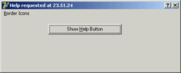
Figure 7.3: The BIcons example. By selecting the Help border icon and clicking the button, you get the help displayed in the figure.
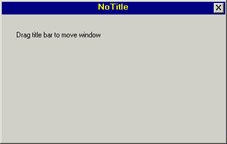
Setting More Window StylesThe border style and border icons are indicated by two different Delphi properties, which you can use to set the initial value of the corresponding user interface elements. You have seen that besides changing the user interface, these properties affect the behavior of a window. It is important to know that in VCL (and obviously not in CLX), these border-related properties and the FormStyle property primarily correspond to different settings in the style and extended style of a window. These two terms reflect two parameters of the CreateWindowEx API function Delphi uses to create forms. It is important to acknowledge this fact, because Delphi allows you to modify these two parameters freely by overriding the CreateParams virtual method: public procedure CreateParams (var Params: TCreateParams); override; This is the only way to use some of the peculiar window styles that are not directly available through form properties. For a list of window styles and extended styles, see the API help under the topics "CreateWindow" and "CreateWindowEx." You'll notice that the Win32 API has styles for these functions, including those related to tool windows. To show you how to use this approach, I've written the NoTitle example, which lets you create a program with a custom caption. First you must remove the standard caption but keep the resizing frame by setting the corresponding styles: procedure TForm1.CreateParams (var Params: TCreateParams); begin inherited CreateParams (Params); Params.Style := (Params.Style or ws_Popup) and not ws_Caption; end; To remove the caption, you need to change the overlapped style to a pop-up style; otherwise, the caption will simply stick. To add a custom caption, I've placed a label aligned to the upper border of the form and a small button on the far end. You can see this effect at run time in Figure 7.4. To make the fake caption work, you have to tell the system that a mouse operation on this area corresponds to a mouse operation on the caption. You can do so by intercepting the wm_ NCHitTest Windows message, which is frequently sent to Windows to determine where the mouse is. When the hit is in the client area and on the label, you can pretend the mouse is on the caption by setting the proper result:
procedure TForm1.WMNCHitTest (var Msg: TWMNCHitTest);
  // message wm_NcHitTest
begin
  inherited;
  if (Msg.Result = htClient) and
    (Msg.YPos < Label1.Height + Top + GetSystemMetrics (sm_cyFrame)) then
    Msg.Result := htCaption;
end;
The GetSystemMetrics API function used in this listing queries the operating system about the vertical thickness (cy) in pixels of the border around a window with a caption but not sizeable. It is important to make this request every time (and not cache the result), because users can customize most of these elements by using the Appearance page of the Desktop options (in Control Panel) and other Windows settings. The small button has a call to the Close method in its OnClick event handler. The button is kept in its position even when the window is resized by using the [akTop,akRight] value for the Anchors property. The form also has size constraints, so that a user cannot make it too small, as described in the "Form Constraints" section later in this chapter.
|
|
||||||||||||||||||||||||||||||||||||||||||||||||||||||||||||||||||||||||||||||||||||||||||||||||||||||||||||||||||||||||||||||||||||||||||||||||||||||||||||||||||||||||||||||||||||||||||||||||||||||||||
|
| Copyright © 2004-2025 "Delphi Sources" by BrokenByte Software. Delphi Programming Guide |
 |