

|
|
|
The Form DesignerAnother Delphi window you'll interact with often is the Form Designer, a visual tool for placing components on forms. In the Form Designer, you can select a component directly with the mouse; you can also use the Object Inspector or the Object TreeView, which is handy when a control is behind another one or is very small. If one control covers another completely, you can use the Esc key to select the parent control of the current one. You can press Esc one or more times to select the form, or press and hold Shift while you click the selected component. Doing so will deselect the current component and select the form by default. There are two alternatives to using the mouse to set the position of a component. You can either set values for the Left and Top properties, or you can use the arrow keys while holding down Ctrl. Using arrow keys is particularly useful for fine-tuning an element's position (when the Snap To Grid option is active), as is holding down Alt while using the mouse to move the control. If you press Ctrl+Shift along with an arrow key, the component will move only at grid intervals. By pressing the arrow keys while you hold down Shift, you can fine-tune the size of a component. Again, you can also do so with the mouse and the Alt key. To align multiple components or make them the same size, you can select them and set the Top, Left, Width, or Height property for all of them at the same time. To select several components, click them with the mouse while holding down the Shift key; or, if all the components fall into a rectangular area, drag the mouse to "draw" a rectangle surrounding them. To select child controls (say, the buttons inside a panel), drag the mouse within the panel while holding down the Ctrl key—otherwise, you move the panel. When you've selected multiple components, you can also set their relative position using the Alignment dialog box (with the Align command of the form's shortcut menu) or the Alignment Palette (accessible through the View ® Alignment Palette menu command). When you've finished designing a form, you can use the Lock Controls command of the Edit menu to avoid accidentally changing the position of a component. This command is particularly helpful, because Undo operations on forms are limited (you can only Undelete), but the setting is not persistent. Among its other features, the Form Designer offers several Tooltip hints:
Finally, you can save DFM (Delphi Form Module) files in the old binary resource format, instead of the plain text format, which is the default. You can toggle this option for an individual form with the Form Designer's shortcut menu, or you can set a default value for newly created forms in the Designer page of the Environment Options dialog box. In the same page, you can also specify whether the secondary forms of a program will be automatically created at startup, a decision you can always reverse for each individual form (using the Forms page of the Project Options dialog box). Having DFM files stored as text lets you operate more effectively with version-control systems. Programmers won't get a real advantage from this feature, because you could already open the binary DFM files in the Delphi editor with a specific command from the designer's shortcut menu. Version-control systems, on the other hand, need to store the textual version of the DFM files to be able to compare them and capture the differences between two versions of the same file. In any case, if you use DFM files as text, Delphi will still convert them into a binary resource format before including them in the executable file of your programs. DFMs are linked into your executable in binary format to reduce the executable size (although they are not really compressed) and to improve run-time performance (they can be loaded more quickly).
The Object InspectorTo see and change properties of components placed on a form (or another designer) at design time, you use the Object Inspector. Compared to the early versions of Delphi the Object Inspector has a number of new features. The latest, introduced in Delphi 7, is the use of a bold font to highlight properties that have a value different from the default. Another important change (introduced in Delphi 6) is the ability of the Object Inspector to expand component references in place. Properties referring to other components are displayed in a different color and can be expanded by selecting the + symbol on the left, as is the case with an internal subcomponent. You can then modify the properties of that other component without having to select it. Here you can see a connected component (a pop-up menu) expanded in the Object Inspector while working on another component (a list box): 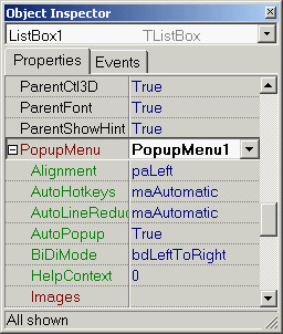 This interface-expansion feature also supports subcomponents, as demonstrated by the new LabeledEdit control. A related feature of the Object Inspector lets you select the component referenced by a property. To do this, double-click the property value with the left mouse button while pressing the Ctrl key. For example, if you have a MainMenu component in a form and you are looking at the properties of the form in the Object Inspector, you can select the MainMenu component by moving to the Menu property of the form and Ctrl+double-clicking the value of this property. Doing so selects the main menu indicated as the value of the property in the Object Inspector. Here are some other recent changes of the Object Inspector:
The Delphi Object Inspector has graphical drop-down lists for several properties. You might want to add one showing the actual image of the font you are selecting, corresponding to the Name subproperty of the Font property. This capability is built into Delphi, but it has been disabled because most computers have a large number of fonts installed and rendering them can significantly slow the computer. If you want to enable this feature, you have to install in Delphi a package that enables the FontNamePropertyDisplay-FontNames global variable of the VCLEditors unit. I've done this in the OiFontPk package, which you can find among the program examples for this chapter. Once this package is installed, you can move to the Font property of any component and use the graphical Name drop-down menu, as displayed here:  There is a second, more complex customization of the Object Inspector that I like and use frequently: a custom font for the entire Object Inspector, to make its text more visible. This feature is particularly useful for public presentations. See Appendix A to learn how to obtain this add-on package.
Property CategoriesDelphi includes the idea of property categories, activated by the Arrange option of the Object Inspector's shortcut menu. If you set this option, properties are arranged by group rather than listed alphabetically, with each property possibly appearing in multiple groups. Categories have the benefit of reducing the complexity of the Object Inspector. You can use the View submenu from the shortcut menu to hide properties of given categories, regardless of the way they are displayed (that is, even if you prefer the traditional arrangement by name, you can still hide the properties of some categories). Although property categories have been available since Delphi 5, programmers rarely use them. The Object TreeViewDelphi 5 introduced a TreeView for data modules, in which you could see the relations among nonvisual components, such as datasets, fields, actions, and so on. Delphi 6 extended the idea by providing an Object TreeView for every designer, including plain forms. The Object TreeView is placed by default above the Object Inspector. The Object TreeView shows all the components and objects on the form in a tree representing their relations. The most obvious is the parent/child relation: If you place a panel on a form, a button inside the panel, and a button outside the panel, the tree will show one button under the form and the other under the panel:  Notice that the TreeView is synchronized with the Object Inspector and Form Designer. So, as you select an item and change the focus in any one of these three tools, the focus changes in the other two tools. Besides parent/child, the Object TreeView shows other relations, such as owner/owned, component/subobject, and collection/item, plus various specific relations, including dataset/ connection and data source/dataset relations. Here, you can see an example of the structure of a menu in the tree: 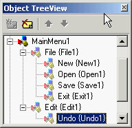 At times, the TreeView also displays "dummy" nodes, which do not correspond to an actual object but do correspond to a predefined object. As an example of this behavior, drop a Table component (from the BDE page); you'll see two grayed icons for the session and the alias. Technically, the Object TreeView uses gray icons for components that do not have design-time persistence. They are real components (at design time and at run time), but because they are default objects that are constructed at run time and have no persistent data that can be edited at design time, the Data Module Designer does not allow you to edit their properties. If you drop a Table on the form, you'll also see items that have next to them a red question mark enclosed in a yellow circle. This symbol indicates partially undefined items. The Object TreeView supports multiple types of dragging:
Right-clicking any element of the TreeView displays a shortcut menu similar to the component menu you get when the component is in a form (and in both cases, the shortcut menu may include items related to the custom component editors). You can even delete items from the tree. The TreeView also doubles as a collection editor, as you can see here for the Columns property of a ListView control. In this case, you can not only rearrange and delete items, but also add new items to the collection. 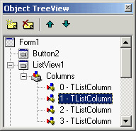
|
|
|||||||||||||||||||||||||||||||||||||||||||||||||||||||||||||||||||||||||||||||||||||||||||||||||||||||||||||||||||||||||||||||||||||||||||||||||||||||||||||||||||||||||||||||||||||||||||||||||
|